Manchester United Home
Comfort
Style
Value For Money
Manchester United Home
When you purchase through links on our site, we may earn an affiliate commission. Here's how it works.
User Reviews
Comfort
Style
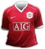
The Manchester United Shirt Is The Same As It Is E
The Manchester United shirt is the same as it is every year. Red, nothing else or a bit more form the creative side. Its been ages since United did something original with their shirts.
Value For Money
Comfort
Style
I Had To Buy The White One, Because This Top Is So
I had to buy the white one, because this top is sooooo ugly!
There A Re No Good Points About The Manchester Uni
There a re no good points about the Manchester United shirt, i really dont like it. Its uncomfortable and worst of all its just boring. Theres nothing that stands out and makes it interesting. Lets hope that next seasons shirt is a bit better.
Value For Money
Comfort
Style
Glory Glory Man Utd I Love That Team The Will Win
Glory glory man utd i love that team the will win in the final
Value For Money
You Might Think The Shirt Looks A Bit Ugly At Firs
You might think the shirt looks a bit ugly at first, but after wearing it a few times it grows on you. It is actually a really nice shirt. Also, the material is good and thick, but the Manchester United Home football shirt is really, really really lightweight and airy (it feels like you're wearing no shirt). If you're a Manchester United fan then get it.
Value For Money
The Manchester United Home Football Shirt Is Not T
The Manchester United Home football shirt is not the best kit United have ever had, but I will still wear it as I'm a huge fan! I feel that it's not been changed as much as the old one, and they have just moved the crest and changed the black to white.
It is one of the better kits in the premiership, as Chelsea's is ugly, as well as Sunderland's. he Manchester United shirt is the best looking! In my opinion!
Value For Money
Comfort
Style
I Bought This Shirt As I Do Every Couple Of Years
I bought this shirt as I do every couple of years having already seen pictures of it on manutd.com and was rather annoyed about it. The design borders on absolutely insane and is no improvement on last years shirt. The pointless placing of the white bits look awful and centering everything BUT the nike tick is ludicrous. I will still wear it with pride but in the back of my mind is the feeling that it could have been so much better.
Value For Money
Comfort
Style
For Some Reason, The Nike Manchester United Home K
For some reason, the Nike Manchester United Home kit actually has the appeal of an old English armor. Having the shield/badge in the middle and the "slash" mark on one sleeve. This shirt doesn't look as bad as the other teams' shirts but it's not fitting for a supposed "upgrade" of the last year's style. And it doesn't even have a fluid design with Nike's other products such as the Aerows ball or the Total series. They're trying to make things looks more retro with the other products but their jerseys are short of complementing the rest. I'd still recommend it though since I'm a ManUtd fan. :)
Value For Money
Comfort
Style
I Am Not A Happy Bunny. Nike's New Manchseter Uni
I am not a happy bunny. Nike's new Manchseter United Home Shirt is horrible. All they've done is taken last years kit, taken off the black bits and slapped a bit of white willy nilly around the collar and the sleeve. And what's with centering everything but the Tick, that's bad! The only redeeming features are it's United and as a Nike shirt at least it will be breathable and comfortable to wear. I think I probabley won't bother getting it.
Q&A
There are no questions yet. Be the first to ask a question.